(Last updated 2/27/14) Note: the most recent posting is at the bottom of the page.
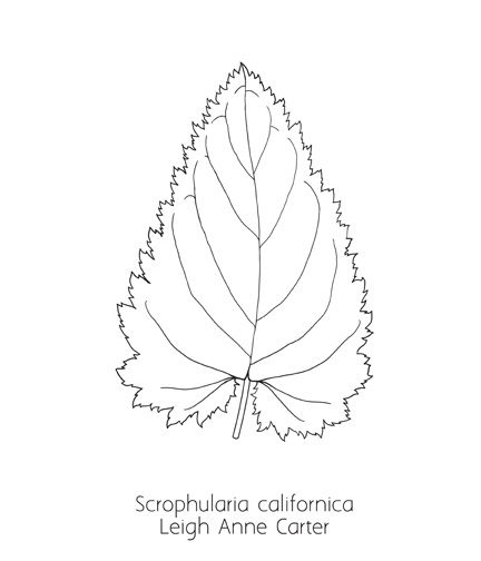
This is our first submission, by Leigh Ann Carter, submitted on 2/22/13. We are still working out the technical details for these illustrations, so for a while I will give you the details. Feel free to use whatever works for you, and as we go along we will probably define a set of options that give you freedom as an artist but gives the book some level of uniformity. A background to the book and illustrator information is online.
Please label the illustrations when you send them to me with the scientific name, then your name (however you like to put it), and the date, separated by underscores. So, this drawing is named "Scrophularia_californica_LACarter_2_22_13.jpg". The underlines are necessary when uploading the images to the web server, as a blank is read as the end of the filename and will be terminated at the space. The leaves I need drawn are here; let me know if you would like to do one, and I will add your name after the leaf.
(These images are just thumbnails of the originals, which I have reduced to 4" at 72 dpi, as we do not need 7" and 600 dpi for the web. We need the 600 dpi for the book, so send them to me in the larger format.)
This is Scrophularia californica, or bee plant. She drew this on a Intuos4 Wacom Tablet, in Photoshop, with the outline 15 pixels wide and the midrib set at 8 pixels, with an image size of 7" tall and at 600 dpi. She saved as a jpg at a compression level of 12.

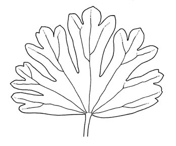
This is a hand-drawn illustration, 7" tall and scanned at 600 dpi, by Marni Fylling:
 |
Marni Fylling |
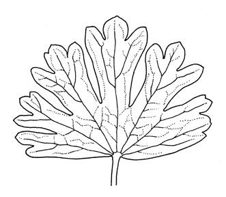
Marni thought that it needed more detail, and submitted this on 3/10/13. I like it.
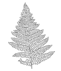
This is Dryopteris arguta, a wood fern, by Heather Gordon. The original is 7" and was scanned at 600 dpi. I need to show her the spore pattern for the underside of the leaf; I forget to send her that. This is lovely.
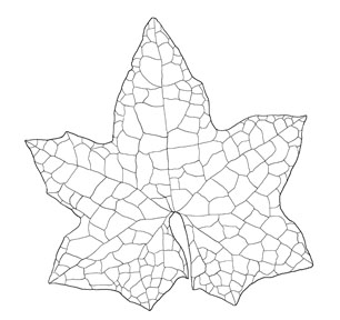
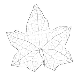
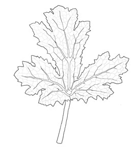
2/24/13: This is a Marah, a wild cucumber, leaf, by Heather Gordon. She and I are working out details: is the venation too prominent? 2/26/13: Heather was kind enough to revise, with line widths of 15, 8, 4, and 1. I think it looks much better with the lighter line widths for the internal details. I would love it if anyone would make comments, replying to the last group email I sent.
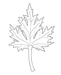
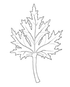
2/26/13: This is Sanicula arctopoides, Footsteps of spring, by Heather Gordon. It is 7" tall and scanned at 600 dpi (left). The single line for each main vein did not seem to properly represent the rather broad veins, so she revised it 2/29/13 with two lines for the main veins (right):
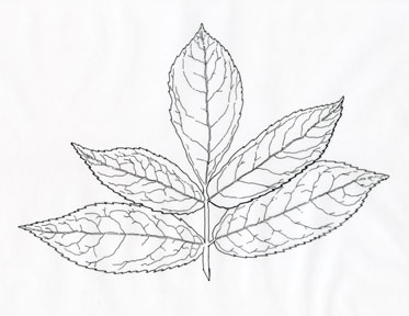
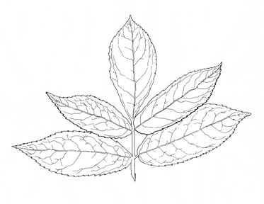
2/29/13: Cynthia Armstrong submitted her first illustration, this wonderful elderberry. She drew it 10 inches by 7 inches, and scanned it at 600 dpi, in color (thumbnail, below, at left). I changed it to greyscale and increased the contrast, which removed a bit of grey from the white areas (below, at right).
2/29/13: Stephanie Rozzo was kind enough to take on a special project. The two blackberries that we have are rather similar, and I thought that we would like to highlight the two important differentiating factors along with the leaf: the flower petal size and the size of the thorns. Here is her rendition of the Himalayan blackberry, a ferocious invasive, drawn with pen and ink, 4" tall (our goal is for something like 6" or 7"), scanned at 600 dpi and sent as a greyscale jpg:
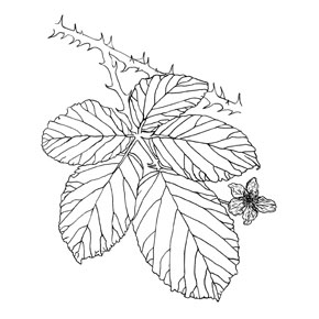 We await her image of the native, Rubus californica. (See below, 4/2/13)
3/4/13: Heather Gordon and I are evaluating this leaf: I think the subsidiary venation helps to tell the texture of the leaf better than the simpler, left side. She revised it 3/11/13 to this, on the right:
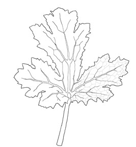
The fine venation is done with a 5 pixel width in grey. Will it be easier for the printer to reproduce a narrower black line than a wider grey line? I expect that the answer is that it is hard to control the degree of grey, but easy to control the degree of black. Do any of you know the answer? Until then, I would suggest use just pure black lines.
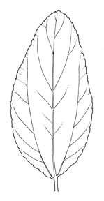
Marni Fylling did this ceonothus leaf 3/10/13. I think it is challenging because it is a rather curved lead, and does in fact have this unusual venation, with many veins at the periphery and little in the center.
I have been out of town, to a meeting in Chicago, just now posting some of the fine illustrations that have come in. This is from Stephanie Rozzo. See what she did above, on 2/29/13. I gave her the task of showing the differences between our native California blackberry (one the left) and the invasive Himalayan blackberry (on the right), which has larger thorns, five instead of three leaves to a grouping, and wider petals, and in a pleasing composition. She composed several photos together and then drew them in Pen & Ink with a 102 crow quill on Vellum:
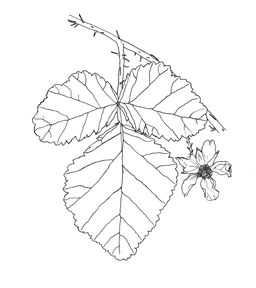
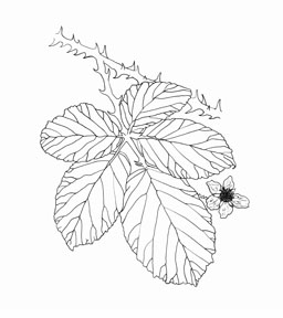
I think that these simple illustrations will help the readers of the book quickly key into the differences. She did them at 9" high at 600 dpi.
Here are another pair of illustrations, by LA Carter. The left is yellow yarrow and the right is lizardtail. Not hard to see that they are related, right? Leigh did these at 7" high at 600 dpi.
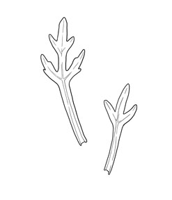
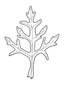
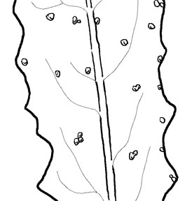
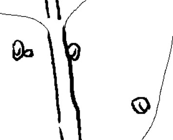
Here is Helminthotheca echioides, bristly oxtongue (what a great name!), done by Heather Gordon. The original is 7" tall, scanned at 600 DPI. The challenge here was to illustrate the "bristles" that stick up from the surface of the leaf. I inserted two details of the leaf to show how she did it. She used a bamboo tablet (a digital drawing pad and pen) in Photoshop, pixel widths 15:8:1, and the bumps are drawn with a varied linewidth. She tells me that she translated them into grayscale and then altered curves and brightness/contrast until she could see the most detail. I think she got this one right, I think it looks like bristly oxtongue.

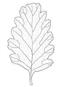
Here is Holodiscus discolor, creambush, by Heather Gordon. She sent it in 5x7 inches, at 600 dpi:
June 27 news: I have not contacted any of the botanical illustrators for a long time. Don't worry! The project is moving along at breakneck pace, so fast I cannot keep up with all the developments and contacts. I have been on the mountain every weekend since Jan 19, 2013, with only three exceptions. We now have about 4.5 GB of photographs. The most important development is that I was contacted by Don Gluensenkamp, the Excutive Director for the California Native Plant Society. He had heard about the photographs we were taking on San Bruno Mountain and wanted to know if he could use some of them in CNPS publications. I took this opportunity to let him know about the project. He is also on the Board for the CNPS Press, the publishing company that we want to publish our book. He knows SBM and is very excited that we are doing the project. He has asked us to submit a proposal to the CNPS Press board! Just what we wanted. Doug Allshouse and I are madly working on a proposal, which must fit a particular format. I am including many of your illustrations in our proposal, as they are key to showing the quality of the project. I am so busy right now that I will not be posting photos of leaves for a bit. If you are dying for something to draw, contact me. But right now, I am putting all my efforts into submitting the proposal. Thank you for all of your support! David Nelson, Project Editor
February 27, 2014: Great news! The California Native Plant Society Press has agreed to publish our book. In addition to about 15 pages of text, I submitted most of your images as part of our book proposal and am convinced that the quality of your work was key in convincing them that our proposal is a quality one. Details are really sparse right now, and the editor for our book is busy with another project, the Flora of North America. Doug and I continue to go out every week to the Mountain, photographing and learning. We went out last weekend with Tom Parker, PhD, and Mike Vasey, PhD, the authors of the manzanita section in the current Jepson Manual, looking at our rare Arctostaphylos species.
Please have patience with us, we hope to be sending out leaves to be illustrated soon.